Whether it’s way back when I used to fumble through htop at work to figure out what’s happening with some on-prem server, or if it’s today when
lazydocker and k9s have grown into critical tools that maximize my productivity,
I’ve always been a huge fan of terminal UIs–especially those that are highly interactive.
So when I got the chance to cross off “Learn how to create a terminal UI” from my to-do list, I was pretty excited to see what I could come up with. In this post
I want to introduce the alpha release of sludge and talk a bit about why I made it. I also want to make the case for why terminal
UIs are fantastic and should become more of a standard offering, even for higher level tools.
The Typical Slurm User Experience
To understand why I created sludge, you have to know a little bit about slurm (which I have a habit of always reading as “SLURM!”). Slurm is a
cluster management and job scheduling system that’s very scalable and is used on extremely large Linux clusters. It provides a single interface for many users to submit
distributed workloads and handles allocating resources as well as monitoring running jobs. It’s open-source and although the top supercomputers on the list maintained by
TOP500 is updated every 6 months, what you can bet on is that the top of that list will feature many that rely on slurm as their
workload management system.
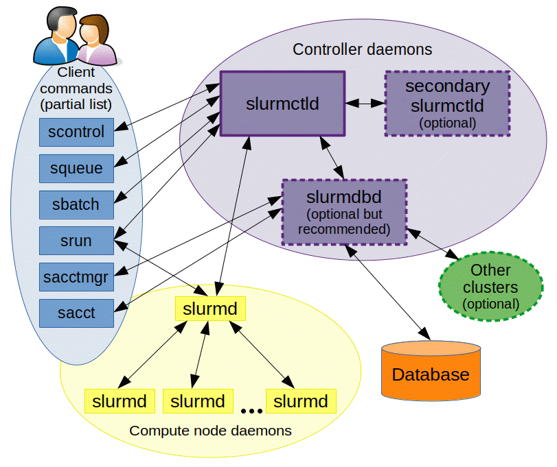
The architechture diagram isn’t too scary and shows that slurm uses a collection of controller daemons that all talk to each other through remote procedure calls (RPCs). Users
are given access to a “head” node that comes with a set of client commands that can be run directly from the terminal such as sbatch, squeue and scancel.

Eventually, the client commands and all of their optional arguments are committed to muscle memory and users typically land on a cadence of configuring and submitting workloads
to the cluster. That being said, it can be a rather jarring experience for new users and even experienced users on those sleepless 3am working sessions when the coffee just
isn’t cutting it anymore. This pain is somewhat alleviated by some visual user interfaces such as sview which ships with slurm or
slurm-web which is another visual tool available in open-source. Although both are great, they require you to move away from the terminal
environment to either a desktop application or a web browser.
Sludge aims to provide a visual tool to supplement the functionality provided by the slurm client commands without requiring you to leave the terminal environment. As you work on
a head node, it’s always one command away–sludge!
So How Does it Work?
Sludge is written in Go and uses the really cool tview library. It’s compiled to a binary that you can just drop into your user directory on a slurm head
node and start using. Its functionality involves either making RPC calls to the slurm control daemon to retrieve information about jobs or nodes, or utilizing the various slurm clients
that are available.
The documentation site includes instructions on the best way to set it up and shows some of the things you can do such as:
- See detailed information on jobs
- See detailed information on nodes
- Run reports against the slurm cluster, i.e. User Top Usage report
- Submit a script to the cluster using
sbatch - Find the partition with the smallest wait time (uses BestSlurmPartition)
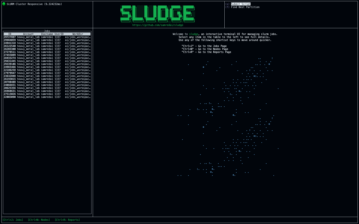
Here’s a glimpse at what the welcome page looks like.

Currently, the alpha release is built for linux-amd64 and slurm version 22.05.
Why Terminal UIs In General are Fantastic
As engineering organizations grow more complex and engineering skill sets become more specialized, investment in tooling remains a steady priority. Today we hear more about “Productivity
Engineers” being crucial components to operating a healthy technology organization.
After a while, you notice a trend with modern tools that have a focus on productivity. They start with a service that “glues together” many existing services and provides an intuitive
abstraction for one or more specialized uses of generic infrastructure. Next, you almost always see a command-line interface (CLI) that leverages the service and provides context such
as a user or project. If services already exist that are robust enough, the tool’s developers can sometimes skip directly to developing the CLI!
Then there’s a long chapter where the tool exists as a production CLI as new features are added and adoption is measured. With strong sustained adoption, more resources are poured
into the project and the abstraction model is translated to a beautiful webapp.
But why wait until that long validation stage to start thinking about the visual representation of the tool’s abstraction layer? Terminal UIs provide a tremendous opportunity to explore
feature groups and navigation flows that aren’t as obvious when you’re looking at logs that simply tell you which CLI commands are being called by users. A visual layout of a tool promotes a certain kind
of awareness for users and translates into more pointed feedback such as…
“I always see these buttons in the corner but I never use them. I wish I they were buttons for X instead.”
“It would be so cool if there was a shortcut to a page that shows Y!”
“There’s way too much information here…most of the time when I come to this page I’m looking for one of three things.”
This kind of feedback provides early insight into which components of the tool are major wins and which might not pan out as valuable as they seemed in the design phase. Plus, when the
tool has proven its value and is rewarded with a dedicated web developer and designer, they’ll be thankful to have a reference that feels more real than some enormous UML diagram!
Special Thanks
I want to give a super special thanks to my wonderful fiancé, Jéa Adams. As a daily slurm user, her insight was critical to the
design and functionality of the alpha release of sludge.
-Sam


